TL;DR:
- Flexible website design ensures that flooring business sites automatically adapt across all devices, improving user experience, SEO, and scalability. It offers a single codebase, enhances rankings, and reduces maintenance, making it essential for modern flooring websites. Maintaining responsiveness through regular testing and updates keeps the site effective amid evolving device trends and Google’s algorithms.
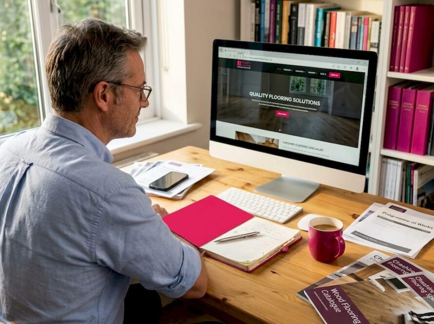
Flexible website design is the practice of building adaptable, device-responsive websites using flexible grids, CSS media queries, and responsive images so that every page adjusts automatically to any screen size. In the flooring industry, where potential customers browse carpet samples on a phone during a lunch break or compare LVT options on a tablet at the weekend, this adaptability is not optional. It directly affects whether a visitor stays, enquires, or leaves for a competitor. The industry term for this approach is responsive web design, and the benefits of flexible website design extend well beyond aesthetics into SEO, conversions, and long-term scalability.
1. The primary benefits of flexible website design for flooring businesses
Responsive web design delivers advantages that compound over time. Here are the core benefits every flooring business owner and marketing manager should understand.
- Improved user experience across all devices. A visitor browsing your wood flooring gallery on a smartphone gets the same clear, navigable experience as someone on a desktop. Flexible layouts and responsive images lead to longer session durations and lower bounce rates, both of which signal quality to Google.
- SEO performance via mobile-first indexing. Google indexes the mobile version of your site first. Responsive design is the foundational requirement for mobile-first indexing. Without it, no amount of keyword optimisation will fully compensate.
- Lower maintenance overhead. One adaptive website replaces the need for separate desktop and mobile versions. That means fewer updates, fewer inconsistencies, and less time spent managing two codebases.
- Better Core Web Vitals scores. Shopify ties responsive design directly to mobile speed and Core Web Vitals improvements. These metrics influence your Google rankings and your visitors’ perception of your business.
- Scalability for new devices. Foldable phones and multi-window tablets are already mainstream. A flexible design accommodates diverse device sizes and window states without requiring a full rebuild.
- Accessibility for a wider audience. The Universal Design principle of flexibility in use means your flooring site serves users with varying needs, from those using screen readers to those on older devices.
Pro Tip: Check your Google Search Console and filter by device type. If mobile users show a significantly higher bounce rate than desktop users, your site is likely not truly responsive.
2. How flexible design boosts SEO and visibility for flooring companies
Search engine optimisation for flooring businesses starts with one non-negotiable: your site must be responsive. Google’s mobile crawler evaluates the mobile version of your pages first, and verifying “Crawled as: Smartphone Googlebot” in Search Console confirms you are compliant. If your site serves a different experience to mobile users than to desktop users, Google sees the weaker version.
The advantages of responsive websites for SEO come down to four practical points:
- Single URL structure. A unified URL and codebase means Google indexes one version of each page. Separate mobile URLs (such as m.yoursite.com) split your link equity and create duplicate content risks.
- Stronger user signals. Responsive design improves engagement metrics. Visitors who can read and navigate your flooring service pages comfortably stay longer and visit more pages. These signals reinforce your rankings.
- Core Web Vitals compliance. Metrics like Largest Contentful Paint and Cumulative Layout Shift are directly affected by how your layout renders on mobile. A responsive site gives you a single codebase to optimise rather than two separate performance problems.
- Avoiding responsiveness breaks. Custom code and plugins frequently break responsive layouts, creating mobile display errors that hurt both user experience and crawl quality. Regular audits catch these before Google does.
“Responsive design is the big rock of mobile-first indexing. Speed and other optimisations cannot improve mobile-first indexing without it.” — Shopify, 2026
The importance of adaptable websites for SEO is not theoretical. Flooring businesses that rank well on Google for terms like “carpet fitter near me” or “LVT installation [city]” almost always have a responsive, fast-loading site underneath those rankings.
3. How flexible design improves UX and conversions on flooring websites
User experience on a flooring website is specific. Visitors want to see product galleries, read about installation services, find your service area, and contact you quickly. A rigid, desktop-only layout breaks every one of those tasks on mobile.
Flexible design solves this by adapting layout and navigation to the device in use. Touch-friendly buttons, collapsible menus, and stacked content columns make it easy for a customer to browse your carpet range on a phone without pinching and zooming. That ease of use translates directly into more enquiry form submissions and more showroom visit requests.
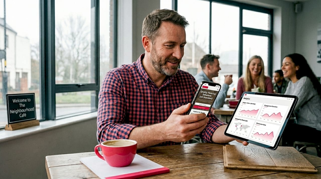
- Flooring galleries load correctly on every screen. Responsive images scale without distortion, so your oak herringbone or luxury vinyl tile looks as good on a 6-inch phone as on a 27-inch monitor.
- CTAs remain visible and tappable. On a non-responsive site, “Get a Free Quote” buttons often fall off-screen or become too small to tap. Flexible design keeps conversion points prominent regardless of device.
- Content personalisation without a rebuild. A single codebase lets you update your service area pages, seasonal promotions, or product ranges once and have those changes reflect correctly across all devices.
- Faster load times reduce abandonment. Slow pages cost you customers. Responsive design, combined with properly sized images, reduces load times on mobile networks. Visitors who wait more than three seconds for a page to load typically leave.
Pro Tip: Use Google’s PageSpeed Insights to test your flooring website on mobile specifically. The mobile score is the one that matters most for both rankings and conversions.
For more on turning website visits into enquiries, see these UX improvements for flooring leads that work alongside responsive design.
4. Flexible design vs fixed or separate mobile sites: a direct comparison
Many flooring businesses still run on fixed desktop layouts or maintain a separate mobile site. Both approaches create problems that compound over time.
| Approach | Maintenance cost | SEO impact | UX quality | Scalability |
|---|---|---|---|---|
| Responsive (flexible) design | Low. One codebase to manage | Strong. Single URL, mobile-first compliant | High. Adapts to all devices | High. Handles new device types |
| Fixed desktop-only layout | Low initially, high over time | Poor. Fails mobile-first indexing | Poor on mobile and tablet | None. Requires full rebuild |
| Separate mobile site (m. subdomain) | High. Two codebases to maintain | Weak. Split URLs, duplicate content risk | Moderate. Often outdated | Low. Doubles the rebuild effort |
The case for why you should choose flexible design is clear from this comparison. A separate mobile site requires you to update content in two places, maintain two sets of pages, and manage two sets of SEO signals. When your flooring product range changes or you add a new service area, that update must happen twice. Mistakes and inconsistencies are inevitable.
Fixed desktop layouts are the worst outcome for a flooring business in 2026. Google’s mobile-first indexing means a desktop-only site is effectively invisible to the algorithm’s primary crawl. Customers browsing on phones see a broken, zoomed-out layout and leave immediately.
Avoiding these pitfalls is covered in detail in this guide to common flooring website mistakes that cost businesses leads every month.
5. Keeping your flooring website adaptable and scalable in 2026 and beyond
Flexible design is not a one-time task. It requires ongoing attention to stay effective as devices, browsers, and Google’s requirements evolve.
- Test across a wide range of devices. Android Developers’ 2026 adaptive guidelines recommend testing across diverse device sizes including foldables and multi-window modes. Do not limit testing to a standard iPhone and a desktop browser.
- Audit plugins and custom code regularly. Third-party plugins added to WordPress or WooCommerce sites frequently introduce layout breaks on mobile. Run a mobile usability audit in Google Search Console every quarter.
- Update your mobile-first design strategy. What worked in 2022 may not work on today’s devices. Review your navigation, typography, and image formats annually to stay current with mobile browsing behaviour.
- Monitor Core Web Vitals in Search Console. Google’s Core Web Vitals report separates mobile and desktop scores. Address mobile failures first. They carry more weight in rankings and affect more of your visitors.
- Optimise content placement for mobile users. Your most important conversion assets, such as your “Request a Quote” form or your flooring gallery, should appear high on the page on mobile. Visitors should not need to scroll past three paragraphs to find a way to contact you.
Single adaptive websites also centralise updates and messaging consistency, which matters when you are running a Google Ads campaign and need your landing page to match your ad copy precisely across all devices.
What I have seen working with flooring websites
I have reviewed a lot of flooring websites over the years, and the pattern is consistent. Businesses that invested in a properly responsive site three or four years ago are still generating enquiries from it today with relatively minor upkeep. Businesses that delayed, or that bolted a mobile theme onto an outdated desktop site, are rebuilding from scratch and losing ground to competitors in the meantime.
The most common mistake I see is assuming that a site “looks fine on mobile” after a quick check on one phone. Real responsiveness means testing on tablets, older Android devices, and different browsers. It means checking that your flooring gallery does not collapse into a single column with oversized images. It means verifying that your contact form works with a touch keyboard.
The other thing worth saying plainly: flexible design is not just a technical nicety. For a flooring business, your website is often the first impression a customer gets. If it is hard to use on their phone, they will call your competitor instead. The flooring website must-haves that actually drive leads all depend on a responsive foundation. Get that right first, and everything else becomes easier.
— John
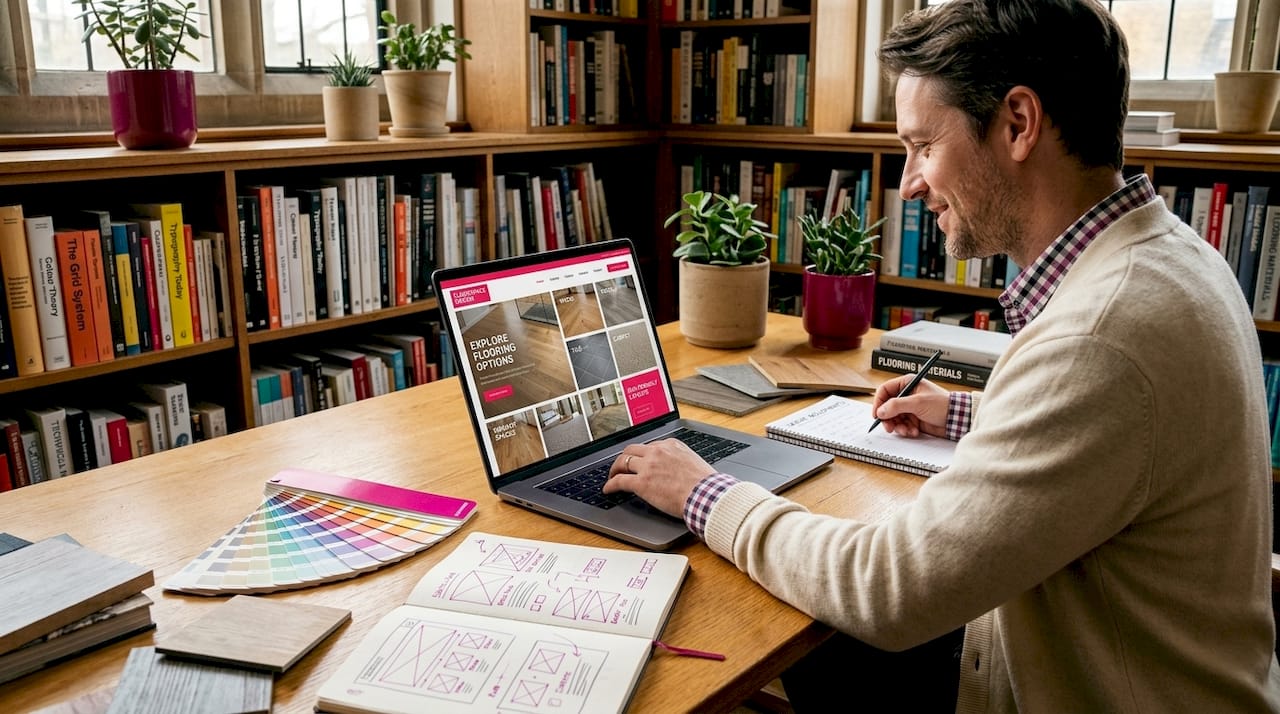
How Truth Digital helps flooring businesses get flexible design right
At Truth Digital, we build websites specifically for flooring businesses. Every site we deliver is fully responsive, mobile-first, and built to perform in Google’s mobile-first index from day one.
We do not use generic templates. We design around the specific needs of flooring retailers, installers, and sanding specialists, making sure your product galleries, service area pages, and enquiry forms work correctly on every device. Our flooring website design services include ongoing technical support so your site stays responsive as devices and algorithms change. You can also see the results we have delivered for other businesses in our website success stories. If your current site is losing you mobile enquiries, let’s fix that.
FAQ
What is flexible website design?
Flexible website design, also called responsive web design, uses flexible grids, CSS media queries, and responsive images to make a website adapt automatically to any screen size or device. It is the standard approach recommended by Google for mobile-first indexing compliance.
Why does flexible design matter for flooring businesses specifically?
Most flooring customers browse on mobile devices before visiting a showroom or making an enquiry. A site that does not adapt to mobile screens loses those visitors immediately, reducing leads and damaging your Google rankings.
Does responsive design improve Google rankings?
Yes. Google uses mobile-first indexing, meaning it ranks your site based on its mobile version. Responsive design is the primary requirement for mobile-first compliance and directly supports Core Web Vitals performance.
How often should I test my flooring website for responsiveness?
Test across multiple devices at least every quarter, and after any plugin update or site change. Google Search Console’s mobile usability report flags issues automatically and is worth checking monthly.
Can I add flexible design to an existing flooring website?
Sometimes, but it depends on the platform and how the site was built. Older fixed-layout sites often require a full rebuild to achieve genuine responsiveness rather than a superficial mobile theme applied on top.