Most flooring websites are losing enquiries every single day. Not because the products are wrong or the prices are off, but because the site is frustrating to use. Visitors land, struggle to find what they need, and leave. It happens fast. Optimised project photos alone can increase credibility and conversions by 30 to 45%, which tells you just how much the details matter. This article walks you through the proven UX improvements that flooring retailers and manufacturers can make right now to turn more visitors into genuine enquiries.
Key Takeaways
| Point | Details |
|---|---|
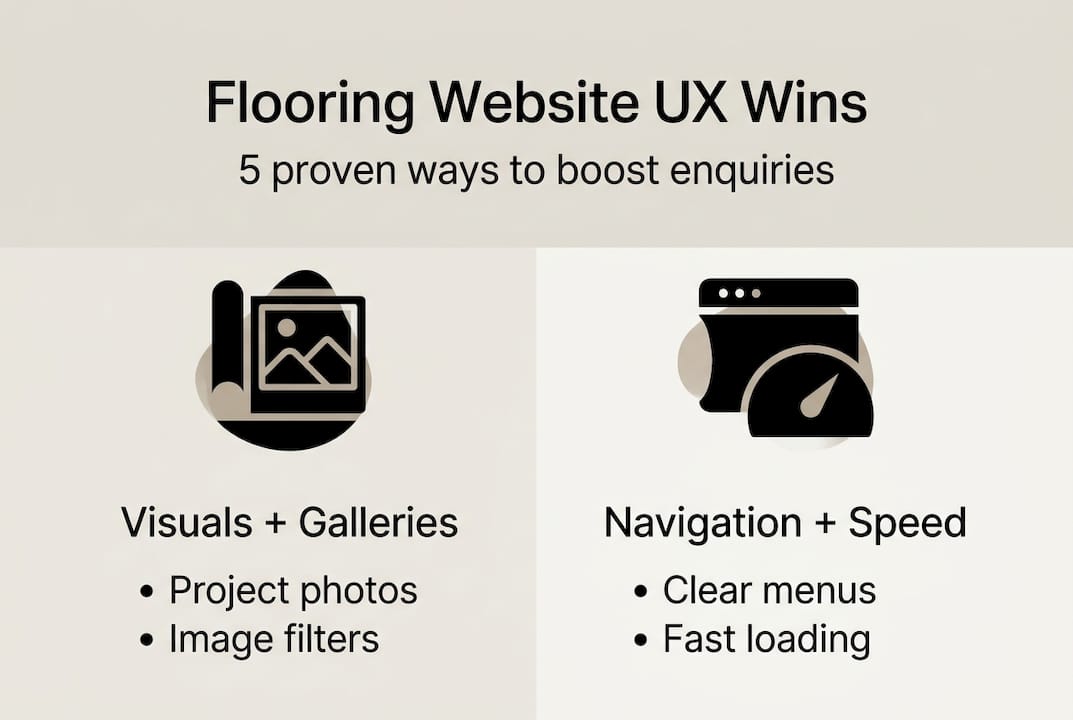
| Visual galleries matter | Project galleries with authentic images can boost credibility and directly increase conversions. |
| Navigation drives engagement | Clear, consistent menus and mobile-friendly layouts help users find what they want and connect faster. |
| Speed and accessibility win trust | Quick-loading, accessible websites with helpful content keep visitors engaged and generate more leads. |
| Ongoing improvement is key | Regular checks, customer feedback, and updates compound small tweaks into big UX gains. |
Defining user experience for flooring websites
User experience is not just about how a website looks. It is about how easy and enjoyable it is to use. For flooring businesses, that distinction is critical. A site can look stunning and still fail to convert if visitors cannot find what they need quickly.
User experience covers everything from page speed to clear navigation and compelling visuals. Every element of your site either helps or hinders the buying journey. When UX is strong, visitors stay longer, trust you more, and are far more likely to get in touch.
Poor UX does the opposite. Slow pages, confusing menus, and hard-to-find contact details push potential customers straight to a competitor. The good news is that most of these problems are fixable.
Here are the key components of strong UX for flooring websites:
- Page load speed (under 3 seconds is the benchmark)
- Clear, logical navigation menus
- High-quality, authentic project imagery
- Mobile-friendly design and layout
- Visible calls to action on every key page
- Regularly updated website content that answers buyer questions
“A flooring website is not a brochure. It is your best salesperson. It needs to guide, inform, and convert, not just impress.”
Think about how your customers browse. Many are on their phones, comparing options, looking at photos, and trying to figure out if you serve their area. Your site needs to make every one of those tasks effortless.
Optimising galleries and visuals: The conversion engine
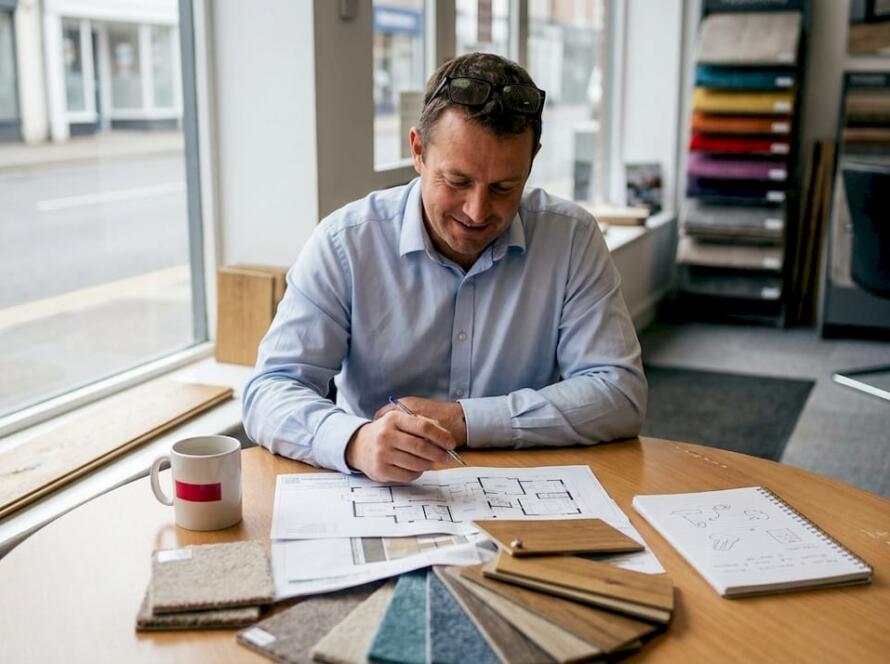
Once you understand UX basics, the gallery becomes the foundation of customer persuasion. Flooring is a visual purchase. Buyers want to see real rooms, real finishes, and real results before they commit to anything.
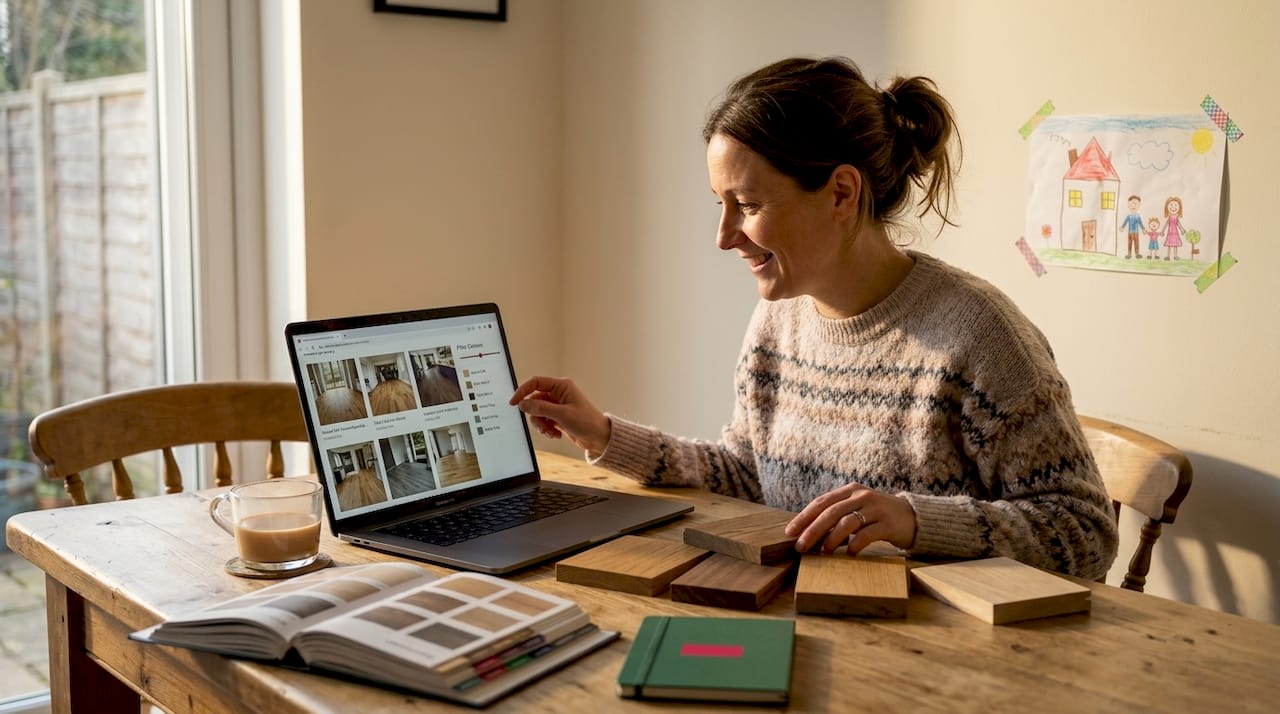
Optimised authentic project galleries with filters and before-and-after sequences can boost conversions by up to 45%. That is not a marginal gain. That is a transformational shift in how many enquiries your site generates.
Here is what a high-performing flooring gallery includes:
| Feature | Why it matters |
|---|---|
| Category filters (carpet, LVT, wood) | Helps buyers find relevant projects fast |
| Before-and-after images | Builds trust and demonstrates quality |
| Zoom or lightbox functionality | Lets buyers inspect detail and texture |
| User-generated content | Adds authenticity and social proof |
| Descriptive alt text on all images | Supports SEO and accessibility |
Image optimisation is just as important as image quality. Use WebP format where possible, keep file sizes under 200KB, and always include descriptive alt text. This keeps your pages fast and your gallery accessible to all users.
Pro Tip: Browse competitor flooring sites to see what gallery formats are working in your market. Look at how they categorise projects and whether they use before-and-after layouts. Then do it better.
A well-structured gallery does more than impress. It answers the buyer’s core question: “Can this business deliver what I want in my home?” For a real-world example of how a flooring showroom can present visuals effectively, this showroom project demonstrates the power of clean, well-organised imagery.
User-generated content, such as photos submitted by satisfied customers, adds another layer of credibility. It diversifies your gallery and shows real-world results that your own photography might not capture.
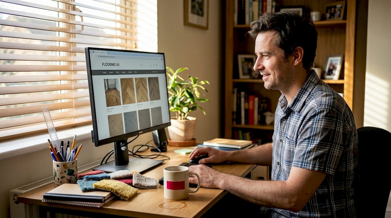
Navigation and usability: Making every click count
Stunning visuals are only effective if users can easily find and act on what they see. Navigation is the backbone of usability. If visitors cannot move through your site intuitively, they will not stay long enough to enquire.
Navigation clarity and reduced friction directly improve user experience and lead conversion on flooring sites. This means keeping menus simple, labelling pages clearly, and making sure your most important content is never more than two clicks away.
Here is a comparison of poor versus strong navigation approaches:
| Poor navigation | Strong navigation |
|---|---|
| Vague menu labels like “Products” | Specific labels like “Carpets”, “LVT”, “Wood Flooring” |
| No location pages | Dedicated pages for each area you serve |
| Contact buried in the footer | Contact button visible in the header |
| Desktop-only layout | Fully responsive, mobile-first design |
| No search function | Search bar for quick product or service lookup |
Mobile-first design is non-negotiable in 2026. Most flooring research happens on smartphones. If your site is clunky on mobile, you are losing a significant portion of your potential customers before they even see your gallery.
Key usability improvements to prioritise:
- Add quick links to your most popular product categories
- Create location-based landing pages for the areas you serve
- Ensure fonts are readable at all sizes (minimum 16px body text)
- Include alt tags on all images for accessibility and SEO
- Test keyboard navigation for users who cannot use a mouse
Proper handling of site enquiries starts with making it easy for visitors to reach you. A clear, prominent contact form or click-to-call button on every key page removes friction and increases the chance of conversion. For broader accessibility best practices, there are established guidelines worth reviewing as part of any site audit.
Regular website maintenance also plays a role here. Broken links, outdated pages, and slow-loading menus all damage usability and trust.
Speed, accessibility, and the role of content
Efficient navigation sets the stage, but speed and helpful content close the deal. A slow website is a conversion killer. Users expect pages to load in under three seconds. If yours takes longer, many will leave before they see anything.
Image optimisation reduces load times by 50 to 70%, directly impacting user satisfaction and search performance. That single improvement can have a measurable effect on both your Google rankings and your enquiry rate.
Here are five practical steps to improve speed and accessibility:
- Compress all images using WebP format and keep files under 200KB
- Minimise unnecessary plugins and scripts that slow page rendering
- Use a content delivery network (CDN) to serve files faster to UK visitors
- Ensure colour contrast meets accessibility standards (4.5:1 ratio minimum)
- Write clear, descriptive alt text for every image on the site
Pro Tip: Run your site through Google PageSpeed Insights once a month. It flags specific issues and tells you exactly what to fix. Small, regular improvements compound over time.
“Accessibility is not optional. An accessible site serves more customers, ranks better on Google, and reduces your legal risk. It is good business.”
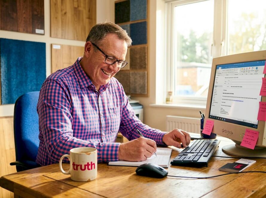
Content is the other half of this equation. Updating your website content regularly keeps your site relevant and builds trust with both visitors and search engines. Answer the questions your customers actually ask. What is the difference between LVT and vinyl? How long does installation take? What areas do you cover?
Clear, informative content supports the buyer journey at every stage. It reassures visitors, reduces the need for them to call with basic questions, and positions you as the expert. Understanding the full range of digital touchpoints for flooring helps you see where content fits into the wider sales process.
Measuring and improving your flooring website’s UX
With the essentials covered, consistent improvement turns decent UX into outstanding results. The best flooring websites are not built once and left. They are tested, refined, and improved on a regular basis.
Monitoring user interactions and feedback highlights critical pain points to address for ongoing UX improvement. Without data, you are guessing. With data, you are making decisions that actually move the needle.
Here is a practical process for ongoing UX improvement:
- Install a heatmap tool such as Hotjar or Microsoft Clarity to see where users click, scroll, and drop off
- Review enquiry form submissions and note any patterns in what customers ask or struggle with
- Collect feedback from customers after jobs are completed, and ask specifically about their website experience
- Review competitor flooring sites quarterly to benchmark your navigation, gallery quality, and content depth
- Set measurable goals: reduce bounce rate, increase time on site, grow monthly enquiry volume
Pro Tip: Even asking five customers “Was it easy to find what you needed on our website?” can surface issues you would never spot yourself. Real user feedback is worth more than any analytics tool.
Small, consistent tweaks have a compounding effect. Fixing one confusing menu label, adding one clear call to action, or improving one slow page can each nudge your conversion rate upward. Over months, those gains add up significantly.
Strong enquiry handling best practice also depends on UX. If your forms are hard to find or awkward to complete, even motivated buyers will give up. Make every step of the enquiry process as smooth as possible.
Why most flooring brands underestimate user experience
Here is something we see repeatedly. Flooring businesses invest in a new website, focus heavily on how it looks, and then wonder why enquiries are still flat. The site looks great. But it is not performing.
The issue is almost always practical, not aesthetic. Slow load times, buried contact forms, galleries with no filters, and content that does not answer real questions. These are the things that cost you leads. Not the font choice or the colour palette.
We have seen businesses transform their enquiry rate simply by fixing common flooring website mistakes that had nothing to do with design. Faster pages. Clearer navigation. A contact button that is actually visible on mobile.
The other thing most brands skip is testing with real users. Not colleagues. Not the web designer. Actual customers. Their confusion is your roadmap. When someone cannot find your product categories or does not know how to request a quote, that is a problem you can fix. But only if you know it exists.
UX is not a one-time project. It is an ongoing commitment to making your site work harder for your business.
Power up your user experience with proven solutions
If you are ready to stop losing enquiries to a frustrating website, we can help. At Truth Digital, we work exclusively with flooring businesses across the UK, and we know exactly what makes a flooring site convert.
From professional design services built around real user behaviour, to flooring SEO services that bring the right visitors to your site in the first place, we offer end-to-end support tailored to your business. You can also explore our website success stories to see the results we have delivered for flooring brands just like yours. Get in touch today for a straightforward UX review and find out exactly what your site needs to perform.
Frequently asked questions
What elements make a great user experience for flooring websites?
Great flooring websites feature fast load times, intuitive navigation, authentic project galleries, and easy enquiry forms. High-quality optimised images and clear navigation boost credibility and conversions directly.
How do optimised galleries affect flooring website conversions?
Optimised galleries with authentic images and filters can increase project conversions by up to 45%, making them one of the highest-impact improvements you can make.
What is the best way to assess UX on my flooring site?
Use heatmaps, customer feedback, competitor review, and conversion tracking for actionable insights. Consistent monitoring and feedback loops highlight performance gaps and improvement areas quickly.
How does image compression impact user experience?
Compressing images can reduce load times by up to 70%, improving both UX and SEO rankings. Image optimisation reduces site load times and directly increases the likelihood of a visitor converting into an enquiry.