TL;DR:
- Most retail websites treat their pages as simple digital brochures, overlooking the importance of UX. Good UX design focuses on clarity, flow, and ease, supporting every shopper’s journey from browsing to purchasing. Implementing streamlined navigation, effective filters, and a seamless checkout reduces friction, increases conversions, and fosters customer trust.
Most retail businesses treat their website like a digital brochure. Something that looks good, lists products, and hopes for the best. But the role of UX in retail websites goes far beyond appearances. User experience (UX) design, the recognised industry term for how people interact with and feel about a website, directly shapes whether a visitor stays, finds what they need, and buys. Get it wrong and you lose them silently. Get it right and your website becomes your best-performing sales channel. This guide covers the principles, practical strategies, and honest perspective you need to make that happen.
The role of UX in retail websites: core principles
UX design is not decoration. It is the architecture of how your website works for the person using it. In retail, that means every click, scroll, and decision a shopper makes is either supported or obstructed by your site’s design.
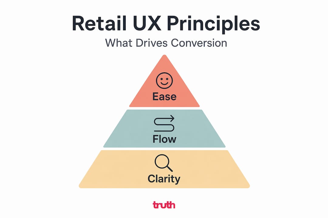
The three goals that define good retail UX are clarity, flow, and ease. Clarity means a visitor understands where they are and what to do next within seconds. Flow means nothing disrupts their path from interest to purchase. Ease means completing any task, whether browsing, filtering, or paying, requires minimal effort.
These principles reduce friction. Friction is what causes hesitation, frustration, and abandonment. A slow-loading page, an unclear category structure, or a hidden search bar are all forms of friction. Each one costs you customers you never realise you lost.
Consider good ecommerce UX design as a holistic practice. It covers the full journey: how someone arrives, how they browse, how they examine a product, and how they check out. Weak UX at any of these stages undermines the entire experience.
The basics that every retail site must get right include:
- Fast page load speeds, ideally under two seconds on mobile
- Clear, logical navigation that mirrors how shoppers think
- A search function that handles misspellings and returns relevant results
- Product pages with enough information to support a confident buying decision
- A consistent visual language that matches your brand across every page
Pro Tip: Use heatmapping tools such as Hotjar to see exactly where visitors click, pause, and drop off. The data often reveals friction points that are invisible from the inside.
Tailored user journeys matter too. A first-time visitor browsing broadly needs different support than a returning customer who knows exactly what they want. Good retail website navigation accounts for both.
Product discovery: filters, sorting, and recommendations
Once a visitor arrives, they need to find the right product quickly. This is where many retail websites fall apart. Poor product discovery UX is one of the biggest hidden conversion killers in e-commerce.

Faceted navigation, the system of filters that lets shoppers narrow down products by colour, size, price, material, and so on, is the backbone of product discovery on any catalogue of meaningful size. But how you implement it matters enormously.
Here is a breakdown of the three tools shoppers use to find products, and how they differ:
| Tool | What it does | Best used when |
|---|---|---|
| Filtering | Narrows results by specific attributes | Shopper knows rough criteria |
| Sorting | Reorders results by a single metric (price, rating) | Shopper wants to compare options |
| Search | Finds products by keyword or name | Shopper knows what they want |
Multi-select checkbox filters with clear “show results” buttons consistently improve user satisfaction and conversion rates. Shoppers want to select several options at once and see relevant results. A filter that reloads the page after every single selection is disruptive and discourages use.
On mobile, the problem is more acute. Desktop filter patterns copied directly onto mobile create frustrating, cramped interfaces. Mobile filters perform best when they open as a separate drawer or bottom sheet, with an explicit “Apply” button that lets the shopper set all their criteria before results update. This prevents constant page refreshes while a customer is still making selections.
Think of filters as decision-support tools, not just navigation. When designed that way, they reduce cognitive load and help shoppers feel confident rather than overwhelmed.
AI-powered personalised recommendations add another layer. Retailers using AI-driven suggestions report measurable lifts in engagement and conversion. “Customers also viewed” and “You might also like” modules, when relevant rather than random, keep shoppers on site longer and increase basket sizes.
Pro Tip: Test your filter system with real users. Ask five people to find a specific product using only the filters. Where they struggle is where you need to redesign.
Checkout UX and reducing cart abandonment
Getting a shopper to the checkout page is only half the job. Cart abandonment averages around 70% across e-commerce, meaning the majority of people who intend to buy do not complete the purchase. Most of that loss is preventable through better checkout UX.
The principles are straightforward, but rarely applied in full:
- Remove unnecessary form fields. Ask only for what you genuinely need to process the order.
- Offer guest checkout as the default option. Forcing account creation before purchase is one of the single biggest abandonment triggers.
- Show a clear progress indicator so shoppers know how many steps remain. Uncertainty creates anxiety and drop-offs.
- Display the full order total, including delivery and taxes, before the final confirmation step. Surprise costs at the last moment kill conversions.
- Offer multiple payment options including digital wallets, which are now expected by a large proportion of mobile shoppers.
Streamlined checkout forms and guest options are consistently identified in UX research as the two highest-impact improvements for reducing abandonment. Neither requires complex development. Both require the willingness to prioritise the shopper’s convenience over your preference for collecting data.
Better checkout design alone can lift conversions by up to 35%. Across a year of trading, that figure represents a significant increase in revenue without any additional spend on advertising or traffic.
Mobile checkout deserves particular attention. Buttons must be large enough to tap accurately. Keyboard types should match the input field (a numeric keypad for card numbers, not a standard text keyboard). Forms should not collapse or reset when a shopper switches between apps. These small details either remove or introduce friction at the most critical moment in the buying process.
Avoiding cognitive overload in retail UX
There is a temptation in retail web design to add more. More content, more features, more animation, more promotions. The assumption is that more gives shoppers more reason to engage. Research tells a different story.
Retail experience design should be targeted and precise. Adding engagement elements indiscriminately increases noise and confusion. The practical test of any design element is whether it moves the shopper closer to a confident decision. If it does not, it is in the way.
Here is a useful process for auditing any page on your retail site:
- Identify the single most important action you want a visitor to take on that page.
- Count how many other elements compete for attention with that action.
- Remove or reduce anything that does not support the primary goal.
- Test the stripped-back version against the original.
This process consistently reveals that less is more in retail UX. A product page cluttered with pop-ups, social proof widgets, upsell banners, and live chat prompts may actually perform worse than a clean, focused page that simply answers the shopper’s questions and presents a clear call to action.
Inclusive design is also worth considering here. A proportion of your customers will have dyslexia, visual impairments, or other neurodivergent characteristics that affect how they process information online. Clear typography, sufficient colour contrast, logical heading structures, and descriptive link text are not just accessibility requirements. They improve the experience for every visitor.
“Experience is not the strategy. It is the test.” — Retail Focus
Consistency across channels matters too. 73% of consumers expect the same visual identity and messaging whether they encounter your brand online, in-store, or on social media. A disjointed experience erodes trust. Your website’s UX does not exist in isolation.
The high-performing ecommerce website features that drive conversions are rarely the flashiest ones. They are the ones that work consistently and get out of the shopper’s way.
My honest take on retail UX
I have seen a lot of retail websites over the years. And the pattern I notice most is that businesses spend heavily on driving traffic, then underinvest in what happens when visitors actually arrive.
The UX improvements that move the needle are rarely the ones that look impressive in a design presentation. They are the small, often boring things: a search bar that is easier to find, a filter system that does not reset on every tap, a checkout that does not ask for your phone number three times.
What I have learned is that the biggest gains come from removing obstacles, not adding features. Most retail sites have friction that nobody on the internal team notices because they are too close to it. Watching a real customer try to complete a purchase for the first time is often a humbling experience.
The retailers I see growing online consistently are not those with the most sophisticated design. They are the ones who treat UX as an ongoing practice, not a one-off project. They test, they measure, and they make small refinements regularly based on what the data shows.
Website UX improvements do not need to be expensive or disruptive. But they do need to be deliberate and informed by how real shoppers actually behave, not by assumptions.
— John
How Truth Digital can help your retail website perform
If you recognise any of the friction points in this article, you are not alone. Most retail websites have them. The good news is that they are fixable.

At Truth Digital, we build and improve websites for retail businesses that need to do more than look good. We focus on the details that drive enquiries and conversions: clear navigation, fast load speeds, well-structured product pages, and checkout flows that do not lose customers at the last step.
Our ecommerce client results show what practical UX improvements deliver in the real world. Not theory. Actual outcomes for businesses like yours.
If your website is underperforming, we would like to help. Take a look at our website development services or get in touch to talk through what your site needs. We are straightforward about what will make a difference, and we work exclusively in the retail space, so we understand your customers.
FAQ
What is the role of UX in retail websites?
UX design shapes how shoppers interact with your site, covering navigation, product discovery, and checkout. Good UX reduces friction and directly increases the likelihood of a visitor completing a purchase.
How does UX affect online shopping conversion rates?
Improved checkout UX alone can increase conversions by up to 35%. Across the full shopping journey, better UX reduces abandonment and increases average order values.
Why do shoppers abandon their carts?
Cart abandonment averages around 70% in e-commerce. The most common causes are unexpected costs at checkout, forced account creation, and overly complex forms.
How should product filters work on mobile?
Mobile filters work best as separate drawers or bottom sheets with an explicit “Apply” button, preventing disruptive page refreshes while shoppers select multiple criteria.
Does website UX affect in-store sales?
Yes. Research shows that site visitors spend 37% more in physical stores and complete 41% more transactions than non-visitors, linking strong website UX to offline revenue.