
TL;DR:
- Responsive web design uses flexible grids, media queries, and optimized images to adapt a single site for any device. It enhances user experience, improves SEO, and reduces bounce and conversion rates by ensuring fast, consistent performance across all screens. Implementing mobile-first strategies, explicit image dimensions, and real device testing are essential for building effective, maintainable responsive websites.
Responsive web design is defined as a development approach that uses flexible grids, CSS media queries, and responsive images to adapt a single website to any screen size or device. Understanding why responsive layouts are non-negotiable in 2026 comes down to three things: user experience, search rankings, and conversions. Google’s mobile-first indexing means your site is crawled and ranked based on its mobile version first. If your layout breaks on a phone, your rankings suffer before a visitor even arrives. For flooring businesses and web designers alike, getting this right is the difference between enquiries and exits.
Why responsive layouts improve UX and SEO

Responsive design delivers two compounding benefits at once: a better experience for users and stronger visibility in search results. These are not separate goals. They reinforce each other directly.
On the UX side, a well-built responsive layout adapts navigation, button sizes, and content hierarchy to match the device in use. Touch targets become finger-friendly on mobile. Text scales without horizontal scrolling. Images resize without breaking the page structure. The result is a site that feels purpose-built for every visitor, regardless of whether they arrive on a desktop, tablet, or phone.
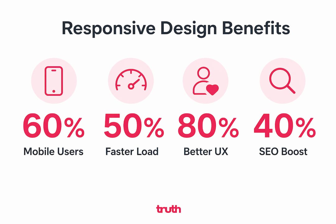
The SEO case is equally direct. Responsive design uses one URL per page with no device detection, which simplifies how Google crawls and indexes your content. Separate mobile URLs or dynamic serving create canonical issues that fragment your link equity and confuse search engines. One codebase, one URL, one set of signals. That is what Google rewards.
The data backs this up clearly:
- Bounce rate rises from 26% to 68% as page load time degrades from under 1.5 seconds to over 6 seconds. That is not a marginal difference. It represents the majority of visitors leaving before they engage.
- Conversion rate drops from 3.8% to 0.7% across the same load time range. For a flooring business generating 100 monthly enquiries, that gap is the difference between a thriving pipeline and a struggling one.
- Mobile users spend roughly 2 minutes on a page compared to 5 minutes on desktop. Every second of friction on mobile costs you a disproportionate share of that attention.
Shopify’s 2026 guidance describes responsive design as the foundation of mobile-first indexing, stating that no amount of speed optimisation fixes a non-responsive site. Greg from Shopify calls it “the big rock.” Everything else is secondary.
What technical components underpin responsive layouts?
Responsive design is built on three core technical pillars. Understanding each one helps you build layouts that perform, not just display.
Flexible grids and fluid layouts. Rather than fixed pixel widths, fluid grids use percentage-based columns that scale proportionally. A two-column layout on desktop collapses to a single column on mobile without any JavaScript. CSS frameworks like Bootstrap and Tailwind CSS implement this by default, which is why they remain the starting point for most professional builds.
CSS media queries. These are the rules that tell a browser how to render a layout at specific screen widths or orientations. A media query might say: “At 768px or below, hide the sidebar and increase the font size to 18px.” Media queries are what make a single stylesheet serve every device correctly. They are the backbone of any responsive build.
Responsive images with srcset and sizes attributes. Serving a 2,000-pixel-wide image to a 375-pixel-wide phone wastes bandwidth and slows load time. The "srcset` attribute lets you define multiple image versions, and the browser picks the right one. Pairing this with modern formats like WebP or AVIF reduces file size significantly without visible quality loss, improving both LCP and CLS scores.
Interaction to Next Paint (INP). Since replacing FID in 2024, INP measures interaction latency from a user’s tap or click to the next visual update. Under 200ms is considered good. A layout that looks responsive but responds slowly to touch events will still fail this metric and drag down your Core Web Vitals score.
Explicit image dimensions. Images without defined width and height cause cumulative layout shift as the page loads, pushing content around and creating a jarring experience. Setting dimensions in HTML or CSS reserves the space before the image loads, keeping your CLS score low.
Pro Tip: Inline your critical CSS (the styles needed to render above-the-fold content) and defer non-critical stylesheets. This reduces render-blocking resources and improves your Largest Contentful Paint score without changing your layout at all.
Responsive vs adaptive design: what is the difference?
Both approaches solve the multi-device problem, but they do it differently. Choosing the wrong one for your project creates unnecessary technical debt.
| Feature | Responsive design | Adaptive design |
|---|---|---|
| Layout type | Fluid, scales continuously | Fixed layouts at set breakpoints |
| CSS approach | Media queries, percentage widths | Separate stylesheets per breakpoint |
| Device detection | Not required | Often required server-side |
| URL structure | Single URL per page | Can use separate URLs |
| SEO friendliness | High. Google’s recommended approach | Lower. Risk of canonical issues |
| Best for | New builds, larger sites | Legacy sites, specific device targeting |
| Maintenance | One codebase to maintain | Multiple layouts to maintain |
Responsive design suits larger or newly built sites because it scales without requiring separate templates for each device type. Adaptive design can make sense for legacy sites where a full rebuild is not feasible and specific device experiences need to be controlled tightly.
For most flooring businesses building or rebuilding a website in 2026, responsive is the correct choice. It aligns with Google’s recommendations, reduces maintenance overhead, and delivers a consistent experience across the full range of devices your customers use.
How can you implement responsive layouts effectively?
Getting the implementation right from the start avoids expensive fixes later. Here is what actually works.
Start mobile-first. Design for the smallest screen first, then scale up. This forces you to prioritise the content and actions that matter most, because you have limited space. Navigation, phone numbers, and enquiry forms should be immediately accessible on a 375-pixel screen. Everything else is secondary.
Set explicit image dimensions. Every image on your site should have defined width and height attributes in the HTML. This prevents layout shift during load and keeps your CLS score in the green. It takes seconds to add and has a measurable impact on both UX and rankings.
Use modern image formats with srcset. Serve WebP or AVIF images with srcset attributes so mobile devices download appropriately sized files. A flooring product gallery with 20 high-resolution images can be the single biggest performance drain on a mobile visit. Solving this one issue often moves LCP from failing to passing.
- Avoid separate mobile URLs (e.g. m.yourdomain.com). They split your link equity and create indexing complications.
- Do not use device sniffing to serve different content. One URL and one codebase is what Google recommends for clean indexing.
- Test on real devices, not just browser emulators. Chrome DevTools is useful, but it does not replicate real network conditions or touch behaviour accurately.
- Run Google’s PageSpeed Insights and Lighthouse regularly. Both flag responsive and performance issues with specific, actionable recommendations.
Pro Tip: Use Google Search Console’s Mobile Usability report to identify pages where text is too small, clickable elements are too close together, or content is wider than the screen. These are the exact signals Google uses to assess mobile experience.
Sites achieving mobile LCP under 2 seconds reduce the mobile-to-desktop conversion gap from 50 to 60 percent down to roughly 25 to 30 percent. That is a direct revenue impact, not a theoretical one. Performance engineering and responsive layout work together. One without the other leaves significant results on the table.
What I have learned from building responsive sites for flooring businesses
I have worked on enough flooring websites to know that most responsiveness problems are not design problems. They are performance problems wearing a design mask.
A site can pass every visual responsiveness check and still haemorrhage conversions because the images are uncompressed, the fonts are render-blocking, or the theme loads 40 plugins before the first byte of content appears. The layout adapts. The experience does not.
The clients who see the biggest gains are the ones who treat responsive design and performance engineering as one project, not two. We audit the layout, the images, the CSS delivery, and the Core Web Vitals together. The common flooring website mistakes we see most often are not broken grids. They are oversized product images, missing image dimensions, and mobile navigation that buries the phone number three taps deep.
My honest advice: do not launch a responsive site and consider the job done. Test it on a mid-range Android device on a 4G connection. That is the real-world experience for a large share of your visitors. If it feels slow or awkward, it is. Fix it before you invest in driving traffic to it.
Iterative testing matters more than a perfect launch. Use Google Search Console, PageSpeed Insights, and real user feedback to find friction points after launch. Responsive design is not a one-time build decision. It is an ongoing commitment to the people using your site.
— John
Build a responsive flooring website that actually converts
At Truthdigital, we build websites for flooring businesses that are responsive, fast, and built to generate enquiries. Not just visually tidy on mobile, but technically sound across every Core Web Vitals metric.
Every site we build starts mobile-first, uses modern image formats, and is tested on real devices before launch. We also provide fast, secure hosting optimised for flooring websites, so your responsive layout loads quickly for every visitor. If your current site is losing leads because it performs poorly on mobile, we can help. Take a look at our flooring website development service or get in touch to talk through what your site needs.
FAQ
What are responsive layouts?
Responsive layouts are website designs that use flexible grids and CSS media queries to adapt a single page to any screen size, from desktop monitors to mobile phones, without requiring separate versions of the site.
Why does responsive design matter for SEO?
Google uses mobile-first indexing, meaning it crawls and ranks your site based on its mobile version. A responsive site with one URL per page gives Google clean, consistent signals and avoids the canonical issues that separate mobile URLs create.
How does load speed relate to responsive design?
A responsive layout alone does not guarantee fast load times. Unoptimised images and render-blocking resources slow mobile performance regardless of layout. Pairing responsive design with performance optimisation is what drives real gains in bounce rate and conversions.
What is the difference between responsive and adaptive design?
Responsive design uses fluid grids that scale continuously across all screen sizes. Adaptive design loads fixed layouts at specific breakpoints using device detection. Responsive is Google’s recommended approach and suits most new website builds.
How do I know if my site is truly responsive?
Run your site through Google’s PageSpeed Insights and check the Mobile Usability report in Google Search Console. These tools flag specific issues such as text that is too small, elements that are too close together, and content wider than the viewport.