
TL;DR:
- Responsive imagery on flooring websites involves serving optimized images based on device and screen resolution to ensure high-quality visuals without sacrificing speed. It uses HTML techniques like "srcset`, modern formats like WebP and AVIF, and lazy loading to enhance performance and SEO. Proper integration of these techniques prevents slow load times, reduces bounce rates, and improves user experience, especially on mobile devices.
Responsive imagery for flooring websites is the practice of serving optimised images based on a user’s device, viewport size, and screen pixel density. It is not a design trend. It is a technical requirement. Flooring products depend on high-fidelity visuals to communicate texture, grain, and colour. Without responsive delivery, those visuals either load too slowly or appear blurred on high-resolution screens. In 2026, the standard approach combines WebP and AVIF file formats, lazy loading, and srcset attributes to serve the right image at the right size, every time.
What is responsive imagery for flooring and why does it matter?
Responsive imagery means your server delivers a different image file depending on what the visitor’s device actually needs. A 4K desktop monitor needs a larger, higher-resolution file. A mobile phone on a 4G connection needs a compressed, smaller version of the same image. The visual result should look identical to the user. The performance difference is significant.

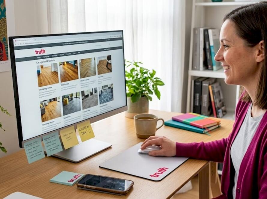
For flooring websites specifically, this matters more than in most other sectors. A visitor browsing oak engineered boards or LVT tiles needs to see grain detail, edge profiles, and colour variation clearly. High-quality flooring images in WebP or AVIF format, combined with lazy loading, deliver that fidelity across desktop, tablet, and mobile without bloating page weight. Flooring retailers who ignore this trade-off pay for it in bounce rates and lost enquiries.
The HTML mechanism behind responsive imagery is straightforward. The srcset attribute on an <img> tag lists multiple image files at different widths. The sizes attribute tells the browser how wide the image will appear in the layout. The browser then picks the most appropriate file. No JavaScript required. No third-party dependency. Just clean, standards-based HTML.
How do responsive imagery techniques improve flooring site performance?
Implementing responsive imagery on a flooring website involves several concrete steps. Here is the core technical process:
- Generate multiple image sizes. For each product image, export versions at 400px, 800px, 1200px, and 1600px wide. Use WebP as the primary format with a JPEG fallback for older browsers.
- Write correct
srcsetandsizesattributes. Thesizesattribute should reflect your actual CSS layout, not a guess. If your product grid shows images at 50% viewport width on desktop and 100% on mobile, write that explicitly. - Apply lazy loading. Add
loading="lazy"to all images below the fold. This defers loading until the user scrolls near the image, reducing initial page weight considerably. - Use AVIF for hero images. AVIF offers better compression than WebP at equivalent quality. For large hero shots of wood flooring or stone-effect LVT, AVIF can reduce file size by 30 to 50% compared to JPEG without visible quality loss.
- Set explicit width and height attributes. This prevents layout shift as images load, which directly improves your Core Web Vitals score, specifically the Cumulative Layout Shift metric.
Compressed modern formats like WebP and AVIF are the standard recommendation for flooring retailers managing large grain and detail image libraries. Failure to adopt them causes high bounce rates and harms SEO in a competitive market.
Pro Tip: Run your flooring product images through Squoosh or Cloudinary before uploading. Both tools let you compare WebP and AVIF output side by side at different quality settings, so you can find the smallest file that still shows the wood grain clearly.
Optimising your flooring photo galleries goes beyond format choice. Compression, selective loading, and correct HTML attributes all work together. Missing any one of them undermines the others.
Common misconceptions about responsive imagery in flooring
Web developers new to the flooring sector regularly encounter terminology confusion. Three distinct concepts share overlapping language, and mixing them up causes real problems for both project scope and SEO.
- Responsive imagery (web performance) refers to the HTML and image delivery techniques described in this article. It is a front-end development concept.
- Responsive Industries is a vinyl and SPC flooring manufacturer with over 30 years in the market. Searches for “responsive flooring” can surface this brand, which creates keyword confusion in SEO campaigns.
- AI room visualisers are interactive tools that let customers place flooring products into photos of their own rooms. These are sometimes described as “responsive” in marketing copy, but they are a separate product category entirely.
Clear terminology avoids SEO keyword cannibalisation and prevents developers from scoping the wrong deliverable. If a flooring client asks for “responsive imagery,” confirm whether they mean image delivery optimisation, a product visualiser, or something else entirely before writing a line of code.
Pro Tip: When briefing a flooring client or writing technical documentation, always use the full phrase “responsive image delivery” rather than just “responsive imagery.” It removes ambiguity immediately and keeps your SEO targeting clean.
The distinction also matters for content strategy. An article targeting developers should focus on srcset, formats, and lazy loading. An article targeting homeowners should focus on visualiser tools and product browsing. Conflating the two produces content that ranks for neither.
How to integrate responsive imagery with flooring visualiser tools
Flooring visualiser tools present a specific challenge. They load high-resolution texture files dynamically, often dozens of them as a user browses product options. Without careful image management, a visualiser can add several megabytes to a page load in seconds.
Here are the key practices for keeping visualisers fast and functional:
- Use smart lazy loading for textures. Only load a texture file when a user selects that product option. Do not preload the entire product catalogue on page initialisation.
- Serve compressed, high-resolution textures selectively. Floori’s AI Visualizer uses 600 DPI textures combined with smart lazy loading to deliver product realism without overloading page weight. This approach closes the gap between what a customer imagines and what they see, which builds buyer confidence.
- Optimise mobile UI controls. Mobile optimisation of visualiser tools requires intuitive touch controls and lightweight asset delivery. A poorly optimised visualiser fails even if the underlying AI detection is technically advanced.
- Synchronise image optimisation with AI mapping. Modern visualisers use AI to detect floor areas in uploaded room photos. The texture images mapped onto those areas must be pre-compressed so the AI rendering step does not become a bottleneck.
- Test on real devices, not just browser emulators. Emulators do not accurately replicate mobile network conditions or GPU rendering behaviour. Test your visualiser on a mid-range Android device on a 4G connection for a realistic performance baseline.
Technical responsive design must extend to the UI of visualisers themselves. Mobile-friendly controls and fast asset loading are not optional extras. They are conversion requirements. You can read more about UX improvements for flooring websites that directly affect enquiry rates.
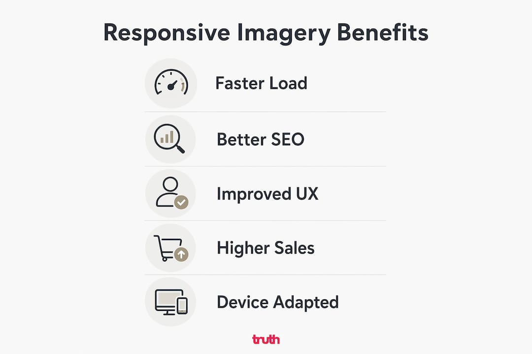
SEO and user experience benefits of responsive imagery
The performance gains from responsive imagery translate directly into SEO and commercial outcomes. Google uses Core Web Vitals as ranking signals, and image delivery affects three of them: Largest Contentful Paint, Cumulative Layout Shift, and, indirectly, Interaction to Next Paint.
| Benefit | Technical driver | Flooring site impact |
|---|---|---|
| Faster page load | Smaller, correctly sized image files | Lower bounce rate, higher time on site |
| Better Core Web Vitals | LCP improvement from optimised hero images | Improved Google ranking signals |
| Improved accessibility | Descriptive alt text on product images | Better screen reader support and SEO indexing |
| Higher mobile engagement | Correct image sizing for small screens | More mobile enquiries and showroom visits |
| Stronger conversion rate | Sharp visuals matched to device capability | Greater buyer confidence in product quality |
Optimised flooring websites with fast-loading, responsive images see improved lead generation and customer engagement. Faster imagery delivery correlates directly with higher user satisfaction and conversion rates. For flooring retailers, where a single sale can be worth hundreds or thousands of pounds, even a modest improvement in conversion rate has a measurable commercial impact.
“The primary misconception in flooring web design is sacrificing speed for high-quality visuals. Balance is achievable using optimised formats and responsive delivery.” — Flooring website design insights
Descriptive alt text is the other underused lever. Every flooring product image should carry alt text that names the product, finish, and colour. “Oak engineered board, brushed finish, natural grey” is more useful to Google and to screen reader users than “flooring image 1.” It costs nothing to write and compounds over time as your product catalogue grows.
What I have learned building flooring sites with responsive imagery
Working on flooring websites has taught me one consistent lesson: developers underestimate how much image delivery affects the entire project outcome. You can build a technically clean site with excellent code, but if the images are oversized JPEGs served at full resolution to every device, the site will feel slow. Clients notice. Visitors leave.
The most common pitfall I see is treating image optimisation as a final step rather than a design constraint. By the time a developer is uploading product photos, the architecture is already set. The better approach is to define your image pipeline, format choices, and lazy loading strategy before a single page template is built. This is especially true for flooring sites with large product catalogues or integrated visualiser tools.
Mobile-first is not a slogan here. It is a practical requirement. The majority of flooring website traffic in the UK arrives on mobile devices. If your visualiser or gallery performs well on desktop but lags on a Samsung Galaxy mid-range phone, you are losing the majority of your potential enquiries. Test early, test on real hardware, and treat mobile performance as the primary benchmark.
My honest recommendation: do not wait for a client to complain about speed. Build a performance budget into every flooring project from day one. Set a target for Largest Contentful Paint, agree on acceptable image file sizes, and use tools like Google PageSpeed Insights and WebPageTest to measure against those targets throughout the build. Responsive imagery is not a one-time fix. It requires ongoing attention as product catalogues grow and new content is added.
— John
How Truthdigital helps flooring businesses get this right
Responsive imagery is one of the areas where getting the technical details right has a direct impact on enquiries and revenue. At Truthdigital, we build and optimise websites exclusively for flooring businesses across the UK, which means we understand the specific demands of high-detail product imagery, visualiser integration, and mobile performance in this sector.
If your flooring website is slow, your product images are not converting, or you are unsure whether your current setup is hurting your Google rankings, we can help. Our flooring website design services cover responsive image implementation, format optimisation, and performance auditing as standard. We also offer SEO for flooring companies that includes image alt text strategy and Core Web Vitals improvement. Let’s talk about what your site actually needs.
FAQ
What is responsive imagery for flooring websites?
Responsive imagery for flooring websites means serving different image sizes and formats based on the visitor’s device and screen resolution. It uses HTML attributes like srcset and sizes, combined with modern formats such as WebP and AVIF, to deliver sharp visuals without slowing the site down.
How does responsive imagery differ from a flooring visualiser?
Responsive imagery is a front-end image delivery technique using HTML and file formats. A flooring visualiser is an interactive tool that lets users preview products in their own room. The two serve different purposes and require different technical approaches.
Which image formats are best for flooring websites in 2026?
WebP and AVIF are the recommended formats for flooring websites. AVIF offers superior compression for large hero images, while WebP provides broad browser support with significantly smaller file sizes than JPEG.
Does responsive imagery affect SEO for flooring companies?
Yes. Faster image delivery improves Core Web Vitals scores, which are direct Google ranking signals. Descriptive alt text on product images also improves indexing and accessibility, both of which contribute to better organic search performance.
What is the biggest mistake developers make with flooring site images?
The most common mistake is treating image optimisation as a final step rather than a design constraint. Defining your image pipeline, format choices, and lazy loading strategy at the start of a project prevents performance problems that are costly to fix later.